We are constantly inundated with the latest scientific studies telling us what we should and shouldn’t eat. So much so, I often wonder if sometimes that information blatantly conflicts with itself –seems I wasn’t the only one.
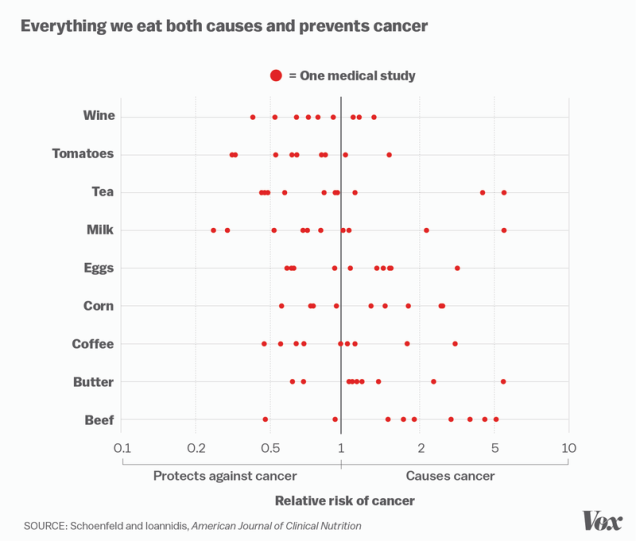
Vox did an article on how science can be quite flawed but it’s a chart within this article that pretty much sums up the major issue and shows you why you shouldn’t always trust what you hear on Doc Oz. The chart takes different individual scientific studies and whether they determined a specific food caused or prevented cancer and puts them on a single graph to show how contradictory the results can actually be.

It’s not to say you shouldn’t believe scientific studies, of course, as if enough research is done the information becomes a lot more viable (sort of how science works, right?) but next time your friend slaps that [insert basically any food here] out of your hand saying it’s going to give you cancer, Google that food and the words “prevents cancer”, there’s a pretty darn good chance you’ll find another study to shut them up.
David is the resident nerd around these parts. Running a popular tech blog (TheUnlockr.com) for the past 6 years, he’s taken his over-analytical mind and made the transition to food.